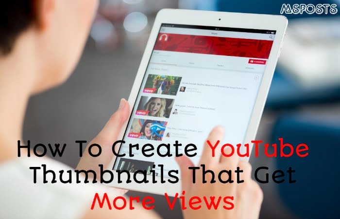
I want to talk about YouTube, but specifically I really want to zone in and focus in on how to create thumbnails that get more views. I’m actually going to share with you the top five golden rules to follow when it comes to creating awesome thumbnails for YouTube channel.
I hope by sharing this framework or sharing these rules with you, you’re going to be able to replicate the best results onto your channel. So that you can really optimize those thumbnails and get more views and more clicks onto your videos.
All right, so the first golden rule that I personally like to follow when it comes to creating thumbnails for my videos is
1. Show your face
I actually experimented with this. I wanted to understand if showing my face and my thumbnails would convert better. Or if using stock photos that I find on Unsplash or something like that would perform better.
And it turns out that when I tried to put a stock photo into my thumbnails, I didn’t get many views. But the moment that I actually turned it back into my face, I got way more views. And I think that the reason why is because a lot of people still like to consume content on YouTube because it still feels human and it still feels real. It doesn’t feel overly commercialized.
When you start using stock photos or images that don’t show your face or anything like that, it takes away that human element in your video.
Now, obviously this might depend on the niche that you’re in, but in my particular niche. Me having a personal brand and me having an educational channel showing my face proved to be really important.
Now, to help you out a little bit more with this. Because I know what it feels like to just freeze and not know what pose to do for your thumbnails, especially if you do a lot of videos.
- Six Universal Human Emotions
So I’m going to share with you the six universal human emotions that I like to follow, when I’m thinking about what to create for my thumbnails, especially when I need to show my face.
- Number one, happiness.
- Number two, sadness.
- Number three, surprise.
- Number four, fear.
- Number five, disgust and
- Number six, anger.
Now that I’ve shown you the six universal human emotions. I really hope that I can add a lot more variety at to your thumbnails, but not only this and speaking of variety. I can also understand that it can be kind of boring to constantly screenshot a part of your video and turn that into a thumbnail. Especially if your background doesn’t change a lot.
That’s why a little hack for you is you can use a free tool called remove image background.
What you can actually do is you can take your photo. Put it onto this website and it’s actually going to help you automatically remove the background. So that you can put any other background in the back. That’s going to allow you to also create more variety in your thumbnails.
All right, so now that you’ve mastered the art of showing your face and removing the background and all the different expressions that you can do.
2. Don’t use Fancy Fonts
The next thing that I like to follow when it comes to creating
Not only this, personally for me, when I’m scrolling through the YouTube feed. I’m always paying attention to the thumbnails over the titles. That’s why if the thumbnail actually has text on it. It gives me a clear idea of what the video is about. Which will give me more inclination to actually click on it and view it.
But when it comes to adding texts, always avoid fancy fonts. And I know that fancy fonts are beautiful. They look amazing on a website. But the thing that you got to realize is that even though these fonts look really great on Pinterest or your website or your blog.
They convert terribly on YouTube and the reason why, especially on a small screen like mobile, these fancier fonts tend to be very, very hard to read.
That’s why no matter how beautiful a font is, don’t’ choose them for your thumbnails and instead offer very simple, very clean and very bold Fonts such as
Oswald Bebas Neue, Montserrat, Poppins.
That’s why if you are someone who’s considering to put text into your thumbnails. Definitely make sure that you are avoiding fancy fonts because it’s simply not going to convert for you.
3. Keep It Simple
Once you’ve chosen a bold font for your thumbnails. The next thing that you want to consider. If You are adding texts to your thumbnails is to keep it simple.
I really like to keep things streamlined and I try my very best to make it less than four words. The reason for this is again on mobile when you’re thinking about looking at thumbnails on mobile. The more texts that you have, the less you’re able to stretch out that text be bigger on your thumbnails.
So when you have only four words, let’s say, it’s going to be a lot easier to enlarge that and to create more of an impact onto your thumbnail.
Now before I dive into the next golden rule that I have for you. I actually want to give you a bonus tip when it comes to adding text to your thumbnails. Because I know a lot of you guys might hesitate on what exactly to put in your thumbnail when it comes to the texts.
Now follow one of the following two options. Option one is
Say it like it is.
Literally use your text to explain exactly what your viewers are going to get from your.
If I you’re creating a video on Instagram Strategy for 2020 then the title is going to be Instagram Strategy for 2020. So that people can expect the exact content that they assume that they were going to get from looking at the thumbnail alone.
Click Bait Title
You can choose the option where you do more of a clickbait title. This is where you don’t really give everything away and maybe you put, you know one or two words that’s really going to evoke a reaction or curiosity from your audience. Now, these are also really effective in order to create an emotional response from your viewers.
Now it’s just up to you to just test the following two options. There is no right or wrong and see what performs better on your channel. For me personally, I like to be straight forward, but for you, you might want to evoke a more stronger emotional reaction with your thumbnails.
4. Avoid Right Hand Side
Now moving onto the fourth golden rule when it comes to creating thumbnails is to keep everything on the right hand side. Once you’ve chosen your font, you know what exactly you’re going to write as the text in your thumbnail and you actually have your face.
I personally want to make sure that my text or whatever is the most important that I want people to read stays on the right hand side. The reason why is because on the left hand side there are tons of icons from YouTube that ended up covering that side on the feed. And so that’s why for me knowing this, I make sure that the most important pieces of information that I like to have on my thumbnail stay on the right side so that it doesn’t get covered up.
5. Make It Big
Now onto the last golden rule when it comes to creating thumbnails and that is make it big. This is something that I’ve pretty much mentioned throughout this post, but I cannot emphasize it enough that your thumbnails gotta be big.
I’m not saying that the size it needs to be big, like the actual dimensions of the thumbnail. Because everyone’s thumbnails dimensions are the same, but I’m saying that the elements in your thumbnail needs to be large enough. So that someone who’s standing maybe five feet away from the computer can still see it.
People still don’t understand that it’s so important, that the elements that you’re putting in your thumbnails is large enough for someone to actually see it on mobile or see it when they’re walking by their computer and all of that. Because the thing is that things might look big on Canva. When you have it at 100% or even 50% largeness. But when you actually shrink it down into a YouTube feed. It actually is microscopic and that’s why it’s so important that you actually consider this when you’re creating thumbnails.
Again this ties back to why with you’re adding text, have less words or if you’re showing your face. Make sure you’re actually really showing your face in the video. So that people can see you and everything like that.
Don’t bother putting small microscopic text or don’t bother putting tiny emoji’s. Cause it’s just going to look like a speck on mobile and even oftentimes on desktop.
Now to help you guys out to make sure that your thumbnail elements are large enough to be optimized for YouTube. What you can do is you can go on Canva and before you download your thumbnail, just shrink it. Just make it 10% so that you can truly see whether or not the things are standing out to you.
Even if your thumbnail is shrunken down to 10% so that’s something that I personally like to do. You don’t have to use Canva, you can use something else, but I hope that that little hack helps You.


Leave A Comment