Introduction: What is a CSS Animation Library?
A CSS library is a collection of CSS code that can be reused in many websites. These libraries are usually created by designers and developers to save time and effort when creating new projects. There are many benefits to using a CSS library. It can help with consistency, maintainability, and efficiency.
The main goal of a CSS library is to make the web developer’s life easier. Users will often use a CSS library to achieve consistency across all projects.
For example, if a website has many buttons, it would be beneficial for the developer to copy and paste the button styles into their CSS library and not have to create each new button style from scratch. This will save time because the developer only needs to make changes in one place instead of designing each button again.
A CSS library can also help with maintainability by separating styles from code. This allows developers to tweak the CSS without editing the code, which can become difficult when you have a lot of CSS files and stylesheets.
CSS can help with maintainability by separating styles from code. Separating styles from code also enables designers to customize their designs easier.
What is a CSS Animation Library
A CSS animation library is a set of predefined animations that can be applied to HTML elements on the page. These animations are usually small and lightweight, making them easy for designers to use.
A CSS animation library is a collection of pre-made animations that can be used in your projects without creating them from scratch. They are typically small and lightweight, making them easy for designers who want to add spice to their designs without getting bogged down in the details.
1. Bootstrap

Bootstrap is a free and open-source front-end web development framework created by Twitter.
Bootstrap was originally developed by Mark Otto and Jacob Thornton at Twitter to encourage consistency across internal tools. It has since been made publicly available as an open-source project on GitHub under the MIT License.
Bootstrap is most commonly used with HTML, CSS, and JavaScript for developing responsive, mobile-first webpages.
Features
Necessity:
Bootstrap saves you time and money and reduces the need for additional libraries when you start a new web project.
Ecosystem:
Bootstrap is the most popular front-end framework for building responsive, mobile-first projects on the web. With Bootstrap’s massive ecosystem of plugins, themes and tools, you can quickly prototype something from scratch with drag-and-drop features.
Speed & Efficiency:
Bootstrap’s features are built to be responsive and mobile-first so that you can use it to build something awesome at every stage of the project cycle.
Twitter support:
Bootstrap is free and open source. It also has official Twitter support, so you can get help or chat with other Bootstrappers!
2. Foundation

Foundation is a free and open-source responsive front-end framework for building sites that work on any device. It has a 12-column grid, a mobile-first approach, Sass variables and mixins, a Gulp build process, BEM methodology, and easy extensibility.
Foundation is a responsive front-end framework for designing websites. It provides a solid starting point for any project and has been used on more than 100,000 sites and by companies like Apple, Google, and Nike.
It was created by Zurb in 2012 to address the need for a mobile-first framework built entirely using semantic HTML5 and CSS3. Foundation has been used to build many high-profile sites, including the Obama presidential campaign site, Beyoncé’s Mrs Carter Show World Tour website and the Guardian’s “Comment Is Free” blog.
Toolkit for any project
The foundation includes over 20 Sass mixins and 20 Sass variables that you can use to customize your project. You can also use the Foundation’s extensive list of components to create any website you want.
Mobile-first design
Foundation is built with mobile-first principles in mind, so it’ll work seamlessly on any device – from desktop to tablet to phone.
Animations
The foundation includes an extensive set of animations that are easy to use and customize. You can use these animations on any element, an image or text, and they’ll work beautifully across all browsers and devices.
Ready for the future
Foundation is constantly pushing the envelope in which web technologies are used, with cutting-edge features like CSS Grid and Service Workers.
One framework to rule them all
Compatible with every web framework, Foundation can build any type of website, from eCommerce to portfolio websites, agency sites to blogs.
Beautifully designed and documented
The Foundation team has made it their priority that Foundation is well documented so that it’s easy for new users and experienced developers alike to get started quickly.
3. Tailwind CSS

Tailwind CSS is a framework for building modern websites without leaving your HTML. It’s built on PostCSS and SASS and uses BEM naming conventions.
It is a set of utilities for creating fast and robust web pages, apps, and interfaces. Tailwind CSS is optimized for building dashboards, photo galleries, blogs, or e-commerce sites.
The framework has many useful features that can make the development process easier. It also has utility classes that are designed to work well with the other components in the framework.
Designer-friendly
Tailwind CSS is designed to be used with any front-end framework so that you can use it with Bootstrap, Foundation, or any other. It also includes a set of atomic CSS classes designed to work well with any framework.
No design required
Tailwind CSS doesn’t require you to design anything before you start coding. You can just start writing HTML and let Tailwind do the rest.
Atomic CSS
Tailwind CSS is built on Atomic CSS, which comprises small, single-purpose classes that can be combined to create any design. This makes it easy to create a website with a consistent look and feel, and it also makes it easy to update or change the design later on.
Powerful PostCSS/SASS integration
Tailwind CSS integrates seamlessly with PostCSS and SASS, so you can use these tools’ power to improve your website.
PurgeCSS Optimization
Tailwind CSS comes with PurgeCSS Optimization, automatically removing unused styles from your website. This means you can use Tailwind CSS to build a website and then use PurgeCSS Optimization to make it load faster.
No more bloated stylesheets
Tailwind CSS is built on the principle of “less is more”. It doesn’t come with any default styles, so you can start with a blank slate and add only the styles you need. This means that your website will have a leaner, cleaner stylesheet.
4. Skeleton
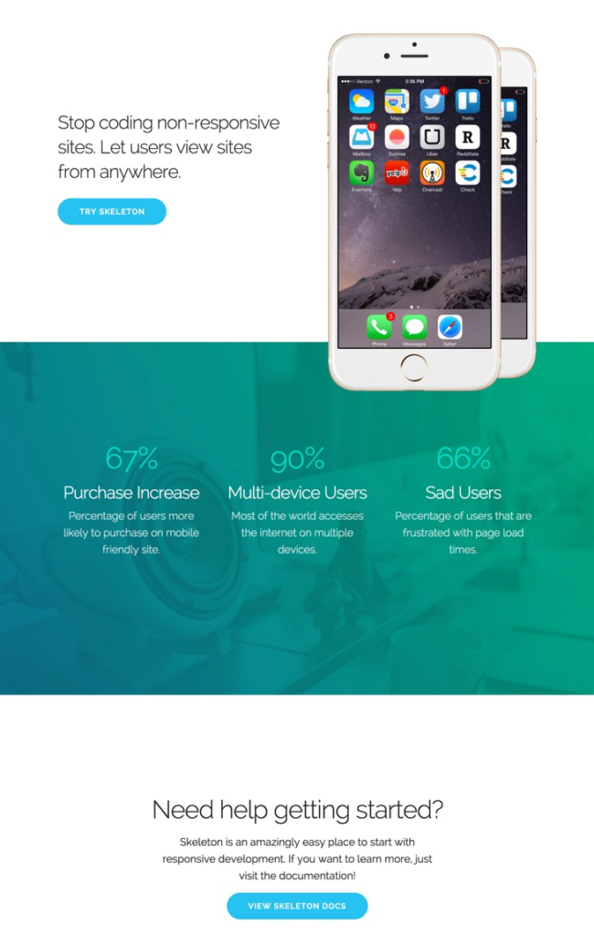
The skeleton is a dead simple, responsive boilerplate that is lightweight and easy to store, manage and handle. Built with a mobile-first approach, the tool is perfect for designers to get started with. It has only the essential components and HTML elements, making it easy to learn and implement, even for beginners. A must-have for creative teams of all sizes.
The skeleton is a new, responsive boilerplate lightweight and easy to store, manage and handle. The tool is built with a mobile-first approach and is perfect for designers to get started with.
Features
A responsive boilerplate
The skeleton is a responsive boilerplate with all the essentials you need to start your next project. It’s lightweight and easy to store, manage and handle. Built with a mobile-first approach, it’s perfect for designers who want to get started quickly. It has only the essential components and HTML elements, making it easy to learn and implement even for beginners.
Mobile-friendly design
With Skeleton, you can create responsive websites optimized for mobile devices. The tool comes with all the essentials you need to get started with your next project – it’s lightweight and easy to store, manage and handle. Built with a mobile-first approach, it’s perfect for designers who want to get started quickly – it has only the essential components and HTML elements, making it easy to learn and implement even for beginners.
No need for a designer
The skeleton is designed with simplicity in mind. You don’t need to be a designer or have the skills to create a beautiful website with Skeleton. All you need is your imagination!
No coding required
The skeleton requires no coding knowledge or special software to use. You can start immediately by downloading and uploading the files to your server.
5. Bulma

Bulma is a CSS framework that makes responsive web design easy. It is built with flexbox and is based on Material Design. Bulma has a small footprint and can be used as a starting point for any web project.
Bulma is an open-source CSS framework that has been around since 2014. It was built out of frustration with the existing CSS frameworks that were not optimized for mobile devices with smaller screens. Bulma was designed to be responsive, meaning it would automatically resize itself depending on the screen size it was being viewed.
Bulma was designed to be lightweight and easy to use, meaning it can be used as a starting point for any web project without having to use many other libraries or frameworks in conjunction with it.
Features
Responsive, mobile-friendly, and open-source
Bulma is a responsive CSS framework based on Flexbox that makes responsive web design easy. It’s lightweight, with a small footprint, and has no dependencies.
Browser-agnostic
Bulma is browser-agnostic, meaning it will work in any browser without the need for polyfills or shims. It also supports all major preprocessors (Sass/Less/Stylus) out of the box.
Easy to use
Bulma has a simple grid system that’s easy to use and understand. It also has a set of predefined classes for common UI elements like buttons, tables, lists, etc.
Easy to customize
Bulma offers a variety of customization options for colours, fonts, spacing, etc.
No Javascript
Bulma is an open-source, responsive CSS framework based on Flexbox. It doesn’t require any Javascript to work.
Modern
Bulma is a responsive and responsive CSS framework based on the latest web technologies. It’s lightweight, flexible, and built with scalability in mind.
6. Materialize CSS

Materialize is a responsive front-end framework based on the material design. It provides a set of responsive UI components built with CSS and JavaScript. The framework is designed to work across various devices and screen sizes, from desktops to mobile phones.
The Materialize framework is designed to have a minimal codebase and be easy to use by developers of all skill levels. The framework comes with JavaScript plugins that can be used with jQuery or Zepto.js frameworks.
Features
Responsive, fast, and lightweight
Materialize is responsive and lightweight, which means it will look great on any device. It also loads fast and is easy to use with minimal complexity.
Award-winning design
Materialize has been awarded numerous awards for its innovative design and high-quality code.
CSS Components
Materialize includes many useful components, such as cards, buttons, navigation, etc.
7. Semantic UI

Semantic UI is a framework for designers and developers to create a shared vocabulary for UI. It consists of components that can create responsive layouts and powerful user experiences.
The Semantic UI framework is open-source and free to use and modify. It also has an active community providing feedback, tutorials and support. The Semantic UI framework consists of a set of components that can be used to create responsive layouts and powerful user experiences.
Features
Design with meaning
Semantic UI is a framework that empowers designers and developers by creating a shared vocabulary for UI. All Semantic UI classes are human words, and coding resembles writing a regular text. Semantic UI offers very well-organized documentation.
Empowering designers and developers
Semantic UI is an open-source project used in production by companies like Google, Microsoft, IBM, Adobe, Slack, and many more. It’s also the foundation of the popular design tool Sketch App.
A shared vocabulary for UI
Semantic UI offers a set of human-readable HTML tags that are easy to learn and remember. This makes it easier to create consistent layouts without having to memorize complex class names or ids.
8. UIKit

UIKit is a powerful and flexible framework that allows you to import only the needed features. With dozens of components and pre-built layouts, UIKit helps you build rich, interactive interfaces.
The UIKit framework provides a variety of high-quality frameworks and components designed to make it easy to create interfaces that look great on any device. It also provides a variety of pre-built layouts that can be applied to those components, allowing for quick prototyping and development.
Features
Customization made easy
UIKit is built on the principle of customization. With our UI-based customizer, you can import only the features you need, and with dozens of components, there’s no limit to what you can create.
Flexible and extensible
UIKit is built on top of Bootstrap 4, meaning it’s fully responsive and mobile-friendly. It also comes with dozens of components that are easy to use and extend – meaning your creativity has no limits!
9. Milligram

Milligram is a minimalist, lightweight CSS framework. It doesn’t have many features or design style choices (which makes it easy for newcomers to get started). This simplicity makes Milligram a popular choice among experienced web designers.
Features
A lightweight and simple CSS framework
Milligram is a lightweight and simple CSS framework that’s a tightly-knit community of developers. It comes with a very low weight of 2 KB when compressed.
Simple CSS Framework
It’s so simple that it can be learned within a day. Unlike other frameworks, Milligram doesn’t come with default styling.
A minimalistic approach to web design
Milligram is the perfect choice for those who want to create websites without fuss or bother, without need for complex code or bloated libraries.
10. Pure CSS

Pure CSS is a set of small, responsive CSS modules you can use in every web project. It’s a tool for building modular, scalable and flexible user interface components.
Pure CSS is an open-source library of responsive modules that can be used in any web project. The library comprises small, responsive modules with no dependencies on other frameworks or libraries. Pure CSS allows for building modular, scalable and flexible user interface components.
Features
Customizable
Every module is customizable and has a default style that you can change to suit your needs.
Easy to use
All Pure CSS components are easy to use and require no configuration. They are also fully responsive and work well on mobile devices.
Small and lightweight
All Pure Colors components are small and lightweight, so they load fast and don’t slow down your website.
Well supported
Pure CSS is well supported by all major browsers, including IE7+, the Latest Chrome/Safari/FF, iOS6+, Android 4.x+
For Animations
11. Motion UI

Motion UI is a Sass library for quickly creating CSS transitions and animations. It’s easy to use, has a small footprint, and has no dependencies.
Features
Easily create animations and transitions.
With Motion UI, you can easily create CSS animations and transitions without worrying about browser compatibility or performance. It’s lightweight, has a small footprint, and is built with performance in mind.
Create beautiful animations and transitions.
Motion UI is a Sass library for quickly creating CSS transitions and animations. It’s easy to use, has a small footprint, and is built with performance in mind.
Series Animations
With Motion UI, you can easily create complex and stunning animations to make your website stand out. With just a few lines of code, you can create a series of animations that are easy to customize and maintain.
12. Hint.Css

Hint CSS is a lightweight, responsive, and easy-to-use CSS framework. It’s only 1.5KB minified and gzipped! Hint CSS is a descendant of Bootstrap, but it only has the styles needed for basic layouts and interactions.
Hint CSS is a lightweight, responsive, and easy-to-use CSS framework. It’s only 1.5KB minified and gzipped! Hint CSS is a descendant of Bootstrap, but it only has the styles needed for basic layouts and interactions. Hint CSS was created with performance in mind – it has no third-party plugins or dependencies, so there are no additional requests to slow down your site speeds.
Lightweight & Responsive
Hint Css is lightweight and responsive, so it’s perfect for any device. It also has a small file size, so your website loads quickly.
Modern & Maintainable
Hint Css is built with modern web technologies like Sass and Flexbox. It also has a modular structure that makes it easy to maintain your website.8
No JavaScript required
Hint CSS is a CSS framework that doesn’t require any JavaScript to work. This means it will work in all modern browsers without additional configuration.
Small file size
Hint Css is only 1.5KB minified and gzipped! This means it will load quickly on your site, even on mobile devices with limited bandwidth.
13. Animate.css

Animate.css is a lightweight, cross-browser library that helps you create beautiful animations with just a few lines of code. It can be used in various projects, from websites to presentations to marketing campaigns.
It’s based on the idea that you should animate only the things that need it, not everything on the page. It’s also about giving designers and developers more time to focus on other things and less time spent deciding how stuff moves around or fades in and out.
Features
Just add water
No need to be an expert in animation or CSS. Just add the animate.css library, and you’re good to go!
Cross-browser compatibility
Animate.css supports all major browsers and OS, including mobile devices, so your animations will work everywhere!
Easy to use
It’s easy to use and requires minimal code – just add the animate.css library, and you’re good to go!
14. Magic Effects CSS

CSS animations can be used to create a more interesting user experience. This article will introduce you to the magic effects CSS library, a set of simple animations that can be included in your web or app projects.
Magic effects CSS is a set of simple animations to include in your web or app projects. It includes a set of predefined animations like fade, shake, and flip. The library is lightweight and easy to use, so it can be easily added to any project.
Features
Quick and easy to use
All you need is a few lines of code, and the library changes your page’s elements. It’s as simple as that. Furthermore, since the animations are done by CSS, they don’t block the page from rendering, making them fast!
Not just for webpages
You’re not limited to using these effects on web pages. The animations work on anything with CSS features like emails, PDFs, presentations, text documents…essentially anything!
15. Vivify.css

Vivify.css is a free and lightweight CSS animation library that helps you animate any element on your website with just a few lines of code.
It has a small library of animations and supports multiple browsers, including Chrome, Firefox, Safari, Opera, IE10+, and Edge.
Design at your fingertips
Vivify.css has been built with developers in mind. It’s easy to use and fast to load, on top of being completely free.
Declutter your code, not your website
Vivify.css is the perfect tool for adding animations to your websites without cluttering your CSS or HTML code with complex animation declarations.
No more headaches
Vivify.css is the perfect solution for those who want to add some life to their website without worrying about animation’s technicalities.
No more coding
Vivify.css has a simple API that makes it easy to animate any element on your website with just a few lines of code.

Marvelous, what a web site it is! This weblog presents useful facts to us,
keep it up.
Hey there fantastic blog! Does running a blog similar to this
take a massive amount work? I’ve very little knowledge of computer programming
however I had been hoping to start my own blog soon. Anyways, should you have any suggestions or techniques for new blog owners
please share. I know this is off subject nevertheless I just needed to ask.
Many thanks!
Just wish to say your article is as astounding.
The clarity in your post is just great and i could assume you’re an expert on this subject.
Well with your permission allow me to grab your RSS feed to keep updated with
forthcoming post. Thanks a million and please continue the gratifying work.